The stations of Chicago’s Initial System of Subways; the State, and Milwaukee-Dearborn lines, are unique examples of Art Moderne style architecture. Designed in the late 1930s, many remain intact despite occasional additions and renovation programs. Beginning in the 1970s, and continuing to the present, the CTA has been renovating in a manner un-sympathetic to the original designs. It was, and still is possible to upgrade these stations while preserving their aesthetic integrity.
 The Architectural Forum
|
The first passenger subway line in the world, the Metropolitan Railway, now part of the London Underground, opened in 1863. The first formal plan for Chicago regarding the passenger subway was the famous 1909 Plan of Chicago. Prior to the Plan, and perhaps influential to it, subways were built in a number of other large cities, most notably Paris, New York, and Boston.
Right: Subways in the Plan of Chicago, 1909. Dashed blue lines are planned streetcar subways. Click to enlarge.
|

|
|
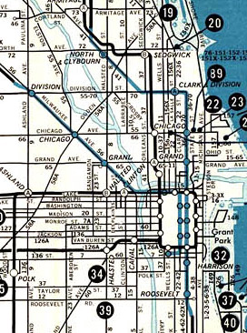
Subways remained on the planning board for two and a half decades until the Federal Government made Works Progress Administration funding available in the mid 1930s. Construction began on Chicago’s two subway lines in 1939. The State Street subway was completed on time in 1943, but a wartime materials shortage pushed the completion of the Milwaukee-Dearborn subway to 1951. A small extension of the Milwaukee-Dearborn subway was constructed along with and opened concurrently with the Congress Expressway, which opened in 1958. More subways were planned, but other solutions, namely, placing rapid transit lines in expressway medians were found to be more cost effective.
Left: 1957 CTA map showing the initial subways in blue. LaSalle station was the southern terminal of the Milwaukee-Dearborn subway from 1951-58.
|
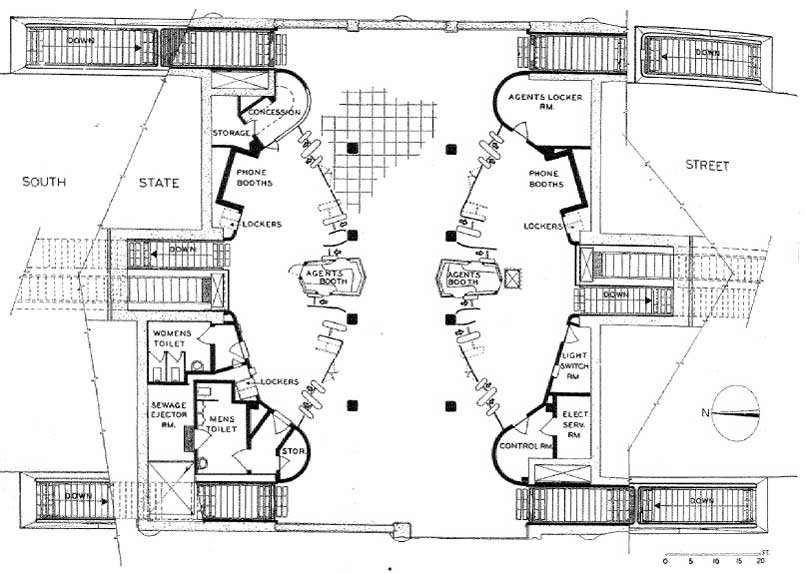
Peter F. Girard’s design of the State and Milwaukee-Dearborn subway stations, with some small variances, was uniform. Stairways lead passengers from the sidewalk to the fare controls and amenities located on a mezzanine just under street level. The walls of the staircase leading to the mezzanine, as well as the mezzanine itself, were faced with a rectangular ceramic tile measuring about a foot on the long end. Some walls are faced with smaller glazed tiles, while on other walls, plastic tile such as bakelite or vitrolite was employed. The larger ceramic tile and the vitrolite have been, since the opening of the subway, incorrectly referred to as ‘structural glass’, a material which they definitely are not.
 The Architectural Forum
The floor of the entire station, including staircases, the mezzanine, and the platform, was smooth concrete with a red finish. In the State Street stations, black granite was used to face I-beams on the mezzanine, and as facing on the wall of the staircase leading down to the platform. Ceramic tile was substituted for black granite in the Milwaukee-Dearborn subway.
|
 The Architectural Forum The Architectural Forum |
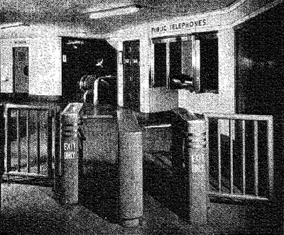
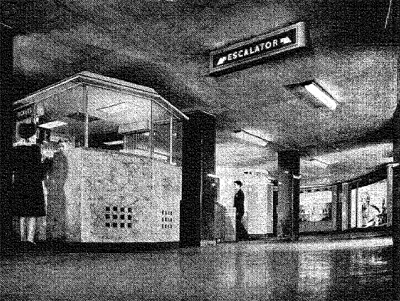
The mezzanine featured amenities not common to current station design. In fact, Clinton station, opened in 1958, did not even have these features. A concession stand, public toilets, telephones, and lockers were all incorporated into the space. The general layout is rectangular, with stairs to the street at each of the four corners. Two agent booths are nearly in the center of the floor, with fare controls offset at an angle toward the corners. The fare controls divided the unpaid area into an hourglass shape, while the paid area resembled a semicircle.
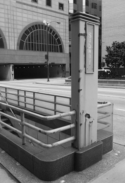
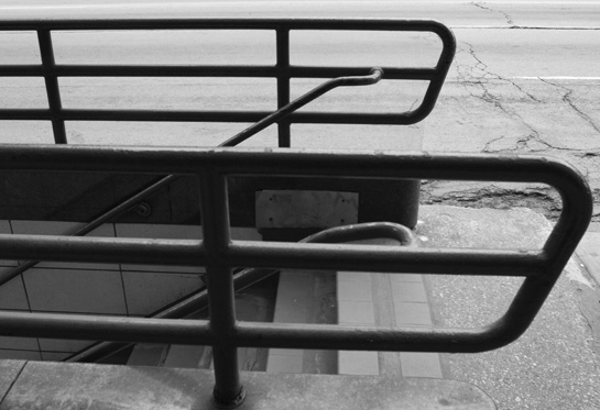
The railing around the portal is reminiscent of a miniature Art Moderne style building. Three cylindrical steel tubes are supported on a granite-faced block of concrete. The tubes curve at a 90 degree angle to meet a 10 foot tall post, which has an inset backlit sign reading “SUBWAY.” Encircling the top of the post, three small decorative bands reinforce the arrangement of the railing.
The typeface used for the backlit sign on the post was the same typeface used for nearly all of the signage throughout the subway system. It bears close relation to Johnston, but is slightly different. Johnston was designed for use on London Underground signage, and its use in Chicago imparted modernity while drawing from pre-existing subway iconography.
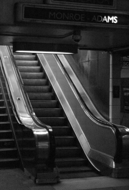
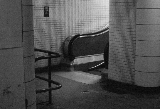
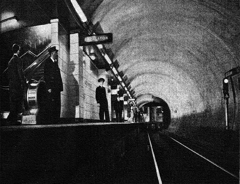
The agent’s booth resembles a miniature trolley car, with slightly protruding pointed ends. The top half is glass, to allow the passenger access to the attendant, while the bottom half is faced with polished granite. To the rear of the agent’s booth, a staircase and escalator leads the passenger down to platform level. In all stations except three, a center island platform was employed, situated between the dual tubes. The alternate layouts for the aforementioned three stations were side platforms, though the reasoning for this deviation is unclear. Materials used on the platforms were similar to those of the mezzanine. Red concrete floors and tubular fluorescent lighting line the platform, and walls are faced with ceramic tile.
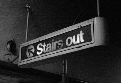
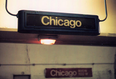
Each station had one color used on accent trim and inlaid signage throughout the platform. The material for the trim and inlay is glazed terra-cotta, in one of four colors; green, blue, brown, and red. Aside from the station names on the wall, a number of different backlit signs directed passengers regarding the placement of escalators and listed the name of the station over the staircase up to the mezzanine. Backlit station signs also hung from the vaulted ceiling, announcing the name of the station.
Photographer unknown
|
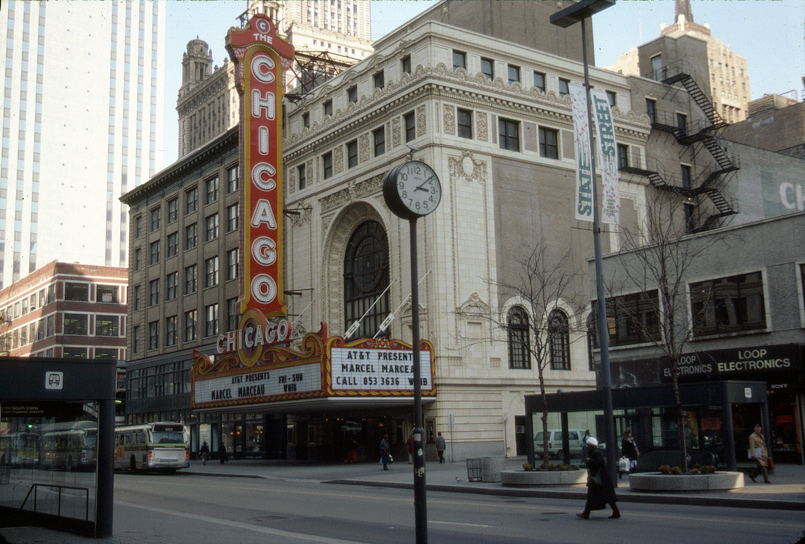
The stations remained intact, save for the addition of some obtrusive advertising, and updated signage, until 1979. That year, State Street, for five blocks between Washington and Van Buren, was converted into a pedestrian mall. The street was narrowed down to two lanes for buses, and the sidewalks were widened and landscaped. As all the street furniture was replaced, so too were the street-level entrances for the subway. The original railings were replaced with chunky late 1970s period designs. The new entranceways closely resembled a bus at three-quarter scale. They were very top heavy, acting as an oversized, obtrusive canopy over the stairway. Chicago Tribune columnist Paul Gapp characterized them as “hulking boxes cluttering the mall, destroying any feel of openness, and blocking formerly unimpeded views.”
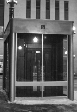
Most of the entrances on Dearborn Street survived the 1970s, except for those in front of the Kluczynski Federal Building, Bank One Tower, and Daley Center. In all of these cases, the original entrances were removed in favor of heavy granite treatments incorporated into the designs of the large plazas on which these buildings sit. Right: This elevator kiosk, located directly across from the Benson & Rixon building near State and Jackson is, as of this writing, the only street level remnant of the 1979 renovations.
|
 |
In 1982, the CTA embarked on the Mayor Byrne-backed Subway Renovation Program. The 53 million dollar plan was to redesign all of the subway stations on both lines between Chicago and Roosevelt on the State subway, and Grand and LaSalle on the Milwaukee-Dearborn. Some of the stated improvements were to be; brighter lighting, acoustical material for sound dampening, and closed circuit television for improved security.
The only stations subjected to this renovation were the mezzanines of Washington and Jackson on both lines. The overall design resembles that of the Chicago Urban Transportation District’s (CUTD) 1977 plan. Stainless steel dominates, from the fully clad agent’s booth to the narrow ceiling bands of signage and lighting. The main difference between the CUTD plan and what was built are steel and glass partition walls, separating the paid and unpaid areas. Any feeling of openness, intended in both the original and CUTD designs, was completely non-existent in this renovation.
View images and read more about the CUTD plan at Chicago-L.org.
The last station to be renovated under the 1982 plan was the Adams-Jackson mezzanine in 1991. The next series of renovations would see the introduction of a new standard design. More so than renovation efforts in the past, this new design is especially heinous. It is not a mere facelift; rather it is a full replacement.
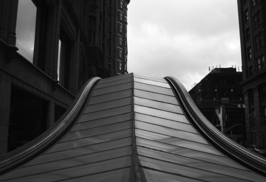
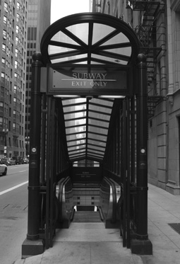
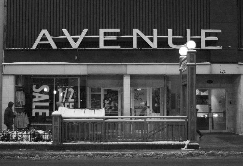
This design replaced the State Street Mall boxes in 1996 wherein the entire pedestrian/bus mall was swapped out with something closely resembling…an actual street. Although a marked improvment, these, along with the entire 1996 Adrian Smith-designed streetscaping, have this post-modern Disney-esque quality that is somewhat disturbing. Referenced are architectural motifs that predate Chicago’s subway, if not most subways in the world.
The streetscape and subway here are retrofitted with Arts and Crafts style decorations that have grown old enough to be safe and comfortable for middle-class, middle-of-the-road taste. There is no reason to tack this stuff on to an Art Moderne subway, and the design disconnect that ensues tends to be jarring at best. At worst, it is a puerile, tongue-in-cheek affront to the original design. Presumably, the users of these facilities find it easy to be complacent towards or even enjoy such unoriginality because of the palatable safety of well-established forms.
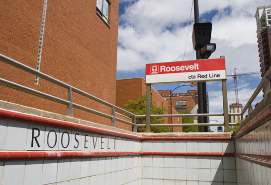
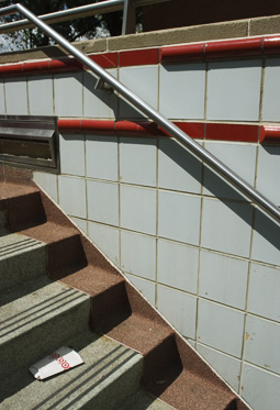
The newest mezzanines incorporate the stainless steel clad agent’s booth and some signage from the 1982 design; however the walls are faced with tile rather than granite. The wall is divided into three sections, separated by bands of colored tile set in relief. The color of the band reflects that of the line the station serves – either red or blue. The top section, which is rather narrow, features the station name. The middle section is composed of two shades of light blue tile outlining the silhouette of a skyline, though it is unclear which skyline. The bottom section is faced with solid blue-green tile.
Some stations have designs comprised of alternating horizontal bands of three colors of tile. These stations, such as Jackson/Dearborn, also have zigzag patterns in stainless steel; however, the general aesthetic remains essentially the same as Roosevelt/State, the first station with the new-style renovation. The elegance and cleanliness of the original design is replaced by garish color illuminated like a stadium.
Creative tile work is used to an even greater extent in the vaulted ceilings of the more recent renovations. Patterned tile, sometimes incorporating the first letter of the station name, make clear reference to early New York tile designs. This becomes problematic however, because Chicago’s subways are not related to those of New York in any significant way. New York subway stations dating to the 1930s are far more sparse and utilitarian than any in Chicago. In the New York stations of the same era, tile was indeed incorporated, but only as monochromatic station signage.
|
 From Wikipedia, Photographer Unknown From Wikipedia, Photographer Unknown
|
|
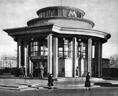
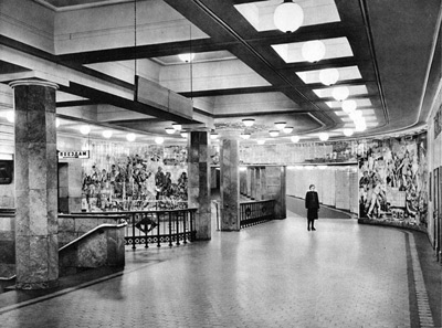
The design of Chicago’s subway stations is closely related to two European examples. Both the Cockfosters extension of the Piccadilly line in London (1933), and the Sokolnicheskaya line of the Moscow Metro (1935) would bear influence on the design in Chicago. The use of granite and marble can be seen at a much more extravagant level on the early Moscow lines (above), while the type design, clean lines, and use of tile are clear derivations from the London Underground stations of the era.
Chicago’s only head house, North/Clybourn, seen at right, is strikingly similar to the Bounds Green and Arnos Grove tube stations in London, seen below. These stations, as well as all of the others on the Cockfosters extension, have been landmarks since 1971. North/Clybourn is not. |
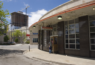 |
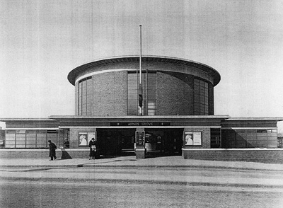
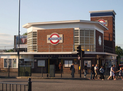 Left: Charles Holden. Right: Sunil060902.
Chicago Department of Subways and Traction. “A comprehensive plan for the extension of the subway system of the city of Chicago…” Chicago, 1939.
Chicago Transit Authority; Department of Development and Planning, Deptartment of Public Works. “Transit planning study, Chicago central area.” City of Chicago. 1968.
Chicago Urban Transportation District. “Chicago central area transit project.” Chicago, 1971.
“Chicago Subway.” Architectural Forum. 81 (1944): 83-86.
DeLeuw, Charles E. “Chicago’s Subway.” American City. 58 (1943): 55.
Gapp, Paul. “State Street: Great Street Gets a Mall That Appalls” Chicago Tribune (1963-Current file); Jul 13, 1980; ProQuest Historical Newspapers Chicago Tribune (1849 – 1986) pg. D2
Garfield, Graham. Chicago-L.org. Last accessed 23 April 2008. http://www.chicago-l.org
Johnson, Mark. “Derailed in Chicago: the City’s Subway System Faces Funding Gaps, Crumbling Infrastructure – and a Political Stalemate.” Planning. 74.1 (2008): 34-38.
Taussig, Dennis. “State Street Mall map and directory, plus downtown Chicago map.” Chicago Events and Entertainment, Inc., c1981.
Whyte, Andy (editor). “Skidmore, Owings & Merrill LLP, Architecture and Urbanism 1995-2000.” The Images Publishing Group. Mulgrave, Australia, 2000.
Young, David. “$53 million facelift set to begin on city subways.” Chicago Tribune (1963-Current file); May 8, 1982; ProQuest Historical Newspapers Chicago Tribune (1849 – 1986) pg. B1
- Remnants of the “L”
- Disused Police Stations
- Fire Insurance Patrol Stations
- Building New: 25 Years of the Harold Washington Library Center
- Old Edgebrook


